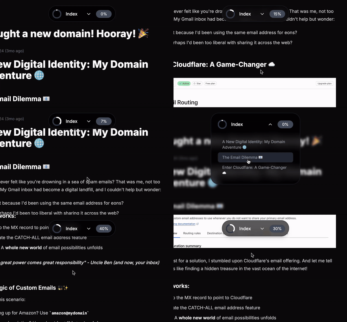
Hey developers! Today, I want to share an exciting UI component I created: a sleek, animated pill navigation that combines functionality with modern design aesthetics. This component is perfect for long-form content and documentation sites.
🎯 Key Features
- Smooth animations powered by Framer Motion
- Real-time scroll progress indicator
- Collapsible navigation menu
- Blur glass effect
- Responsive and accessible design
💡 Technical Highlights
Scroll Progress Tracking
One of the coolest features is the circular progress indicator that shows how far you've scrolled through the content:
const handleScroll = () => {
  const scrollPos = window.scrollY;
  const totalHeight = document.body.scrollHeight - window.innerHeight;
  let percent = (scrollPos / totalHeight) * 100;
  setScrollPercent(Math.round(percent));
};
Animated SVG Progress Circle
The progress is visualized using an SVG circle that fills up as you scroll:
<motion.circle
  stroke="currentColor"
  strokeDasharray="100"
  strokeDashoffset="100"
  animate={{ strokeDashoffset: 100 - (scrollPercent / 100) * 100 }}
  transition={{ duration: 0.4, ease: 'easeInOut' }}
/>
Smooth Animations
The pill expands and collapses with a spring animation for a natural feel:
<motion.div
  layout="position"
  animate={{
    width: isOpen ? '320px' : '240px',
    height: isOpen ? '16rem' : '3.6rem',
  }}
  transition={{ type: 'spring', stiffness: 100, damping: 14 }}
>
🎨 Styling
The component uses Tailwind CSS for styling, featuring:
- Glass morphism effect with
backdrop-blur-md - Smooth transitions
- Custom scrollbar
- Responsive layout
🚀 Usage
To use this component in your project:
const headings = [
  { id: 'section1', text: 'Introduction', level: 1 },
  { id: 'section2', text: 'Getting Started', level: 1 },
];

<PillNavigation headings={headings} />
🔗 Source Code
Want to see this component in action? Check out my personal website project Ohtter, where I've implemented this navigation component along with other modern React features and animations.
Feel free to:
- Star the repository if you find it helpful
- Fork it to use as a starting point for your own projects
- Submit issues or pull requests if you have suggestions for improvements
🎉 Conclusion
This Pill Navigation component demonstrates how we can create engaging, interactive UI elements that enhance user experience while maintaining clean, maintainable code. Feel free to customize and extend it for your needs!
Remember to install the required dependencies:
Happy coding! 🚀